- ITO Corporation Homepage
- Information
- Notifications
- Introducing our New Corporate Logo
Introducing our New Corporate Logo
60 years after its establishment, ITO Corporation enters its second "startup phase" and updates its corporate logo to build a new corporate brand
In 2013, ITO Corporation celebrated its 60th year (consider a year of "rebirth" in Japan). While we value the knowledge and experience we have developed in that time, we aim to grow into a company that continues to create new value and provide the best possible solutions for our customers. By imbuing the new corporate logo with this aggressive stance, we will work toward building a renewed corporate brand.
Concept
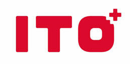
The + (plus mark) in the upper right is an expression of the company's mission to create value through new combinations. It symbolizes ITO Corporation's reason for existence—to connect people to people and products to products.
Additionally, just as passion is indispensable for innovation, we have selected our new corporate color to be a passionate "ITO Red." The new color shows the company's renewed resolve.